Hello and welcome to our group Media A2-level blog. Thank you for taking time to look around!
You can navigate around our blog by clicking on the links on the right hand side of the page. There you will also find a link to our class blog (which contains links to the other blogs from our school). You can filter posts by labels or date, and there is a blog archive if you want to look through chronologically. You can find our individual evaluations by clicking on the labels 'Anna Evaluation', 'Emily Evaluation', 'Mila Evaluation' and 'Sharlene Evaluation'. Our evaluation answers are posted here from 1-4 for your convenience but some posts may appear on the next page so please press "Older Posts" at the bottom of the page if it appears.
All our research and planning for the project is under the research and planning label, and it is possible to see what we each contributed to the process if you click on our name labels - Anna, Emily, Sharlene and Mila. You can watch our final music video, digipak and website above (at the top of our blog) - we really hope you enjoy browsing through our texts as they are the products of a lot of hard work and creativity.
Once again, thanks for your time and we hope you enjoy reading and watching the content on our blog!
Anna Rawe (Candidate no. 1630)
Emily Lawson (Candidate no. 1415)
Sharlene Gandhi (Candidate no. 1200)
Mila Hrisimova (Candidate no. 1300)
Music Video (left) Album Cover (right)
Website
Friday 24 January 2014
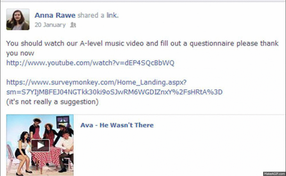
Sunday 19 January 2014
Question 1: In what ways does your media product use, develop or challenge forms and conventions of real media products?
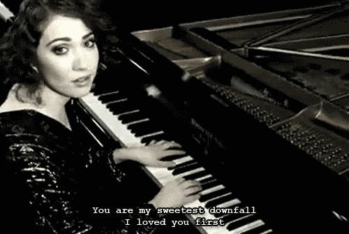
Having conducted research into indie pop artists and their brand identities, as well as the stylistic technique of a constructed set and the format of one-shot music videos, we established lists of conventions that we either chose to use, develop or challenge. We recognised these conventions by analysing real media products such as Lily Allen's The Fear, Regina Spektor's How and Lenka's website (lenkamusic.com), that which helped us to construct our own music video, album cover and website. In my opinion, as well as following certain conventions, we subverted some, particularly of representation, in order to convey our dominant message of women being strong and autonomous.
Style of Music Video
It was very early on in the
project, upon hearing the slightly vintage feel of Lily Allen's track, He Wasn’t There, that we decided to
create an artist with a distinctively retro style. Not only does this style
correspond with current trends of what our target audience is interested in,
but we also feel that this retro style strongly supports Ava’s brand as one
that challenges the convention of the sexualisation of women in contemporary
music videos.

As you can see above, we drew
visual inspiration from iconic photographs of actresses such as Audrey Hepburn
and Marilyn Monroe, both of whom had extremely individualistic styles, which
was something that we really wanted to instil in the character of Ava.


 From left to right: image used on the album cover, stylised image for the website, a photo from the music video shoot.
As you can see above, we took aspects of our style moodboard and embedded them into each media product, such as printed, feminine dresses, playful headpieces and makeup techniques such as winged eyeliner and vibrant lip colours.
As you can see above, we took aspects of our style moodboard and embedded them into each media product, such as printed, feminine dresses, playful headpieces and makeup techniques such as winged eyeliner and vibrant lip colours.
Consumption Habits
One of the purposes of a music
video is to be visually immersive to the viewer, who would then be persuaded to
purchase the single. Thus, music videos are constructed and designed to be
watched repeatedly. As ours was a one-shot, we could build on this purpose of
music videos, as viewers are able to immerse themselves into the
video by following each of the characters through the narrative. We found, through our research, that artists such as Cocknbullkid and Taylor Swift had also used characterisation as a means of encouraging viewers to rewatch their one-shot music videos.
 |
| Cocknbullkid's video for Yellow features various set hands playing the roles of dancers, builders, and French men |
 |
| In Taylor Swift's one shot video for We Are Never Ever Getting Back Together, the audience simultaneously sees Taylor and her boyfriend, who is cheating on her at the time |
 |
One particular example is demonstrated through this screenshot, where a lot of things seem to be happening - in the foreground, Ava is on her dinner date with her boyfriend, whilst in the background, the viewer sees some comical conflict between the serenaders and the character of the ex-wife.
|
Music Video Narrative
Conventionally, music videos are
edited between performance sequences and narrative sequences, in order to
create a division between the character that the artist is playing and the
artist themselves. However, we also found, through our research, that in the
indie pop genre, artists tend to perform throughout the music video, even
during the narrative sections.
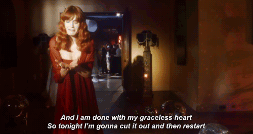
Top left: Regina Spektor in Samson; Top right: Florence Welch in Shake It Out; Bottom left: Kate Nash in Mouthwash; Bottom right: Lily Allen in The Fear
This is how I would categorise
the narrative/ performance balance in He
Wasn’t There:

 |
| "I didn't care about the lies": An example of Ava performing whilst being within the narrative, which I think heightens the notion of 'exposing' the true colours of her boyfriend |
Andrew Goodwin’s Music Video
Theory (Dancing in the Distraction
Factory, 1992)
We analysed our video using
Goodwin’s theory of music video features, such as the use, development and challenging
of genre characteristics, record label demands, intertextual referencing and
the relationships between visuals, music and lyrics. Please double click on particular parts of each slide to zoom in to text, photographs and videos.
For example, as can be seen on the first slide of the presentation, we established conventions for not only the indie pop genre, but also videos that incorporated a constructed set and utilised the one shot structure:
- Extensive use of props and costumes as semiotic devices
- Colourful, bright, almost childlike sets to connote happiness
- Usually an upbeat song and video that may have a satirical stance or a message to convey
- Performance and narrative are usually interlaced, as the narrative is often very strong for videos in the indie pop genre
As He Wasn't There is a one-shot music video, very little of Vernallis' theory applies to it. However, one thing that Vernallis states in her theory on music video editing is that the cuts are usually 'foregrounded'.
One part of our music video that was edited was the section in between the second chorus and the final boat scene, which is separated by the red and white tablecloth flying across the screen. This was added in Adobe After Effects to continue the illusion of the video being a one-shot, and thus became 'background editing', which corresponds to David A. Cook's theories about classical Hollywood cinema and realist narratives (A History of Narrative Film, 1985).
The fact that our editing is closer to film editing and music video editing accentuates the notion of the music video being a parody of stereotypical romantic films, as we echo their editing style too.
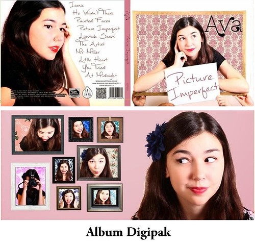
Album Cover
The album cover has the primary functions of:
- Acting as a form of visual advertising, whereby the consumer is given the power to choose whether or not they are attracted to the album
- Providing a flavour of the music or the genre
- Being memorable, original and thus valued by the consumer
- Providing information about the music and its production


 |
Above are some debut album covers of female artists in the indie-pop genre. Although the album art varies, the covers are generally quite conceptual, but what is important across all of these covers is the artist's name. The name/ logo is the most prominent part of the cover, because as a debut artist in the music industry, it is perhaps more important to establish an easily recognisable name rather than a concrete visual style.
Below is an annotated version of our digipak, which demonstrates both how we used the conventions of album art, and certain aspects we could have improved on.

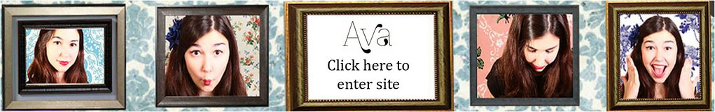
Website
The website, in a marketing
campaign, serves as the hub, whereby not only is the artist promoted, but also the
institutions that are associated with the artist, including the record label
and any brands that the artist has collaborated with.
The presentation below is a comparison displaying
how we researched and implemented website conventions, using Lenka’s website as a reference
point, and how we decided to either incorporate or challenge them.
Using, developing and challenging conventions of websites from SharleneGandhi1
Prior to creating Ava's website, we also discovered that the three most important things for a music artist's website to have were interactive opportunities, purchasing opportunities and a consistent sense of branding. I analysed A Fine Frenzy's website according to these three criteria, and then, going back to Ava's website further explored the opportunities we had for our audience members.
A potential criticism of our website could be that we did not promote our record label, Fruit Bowl Records, enough, nor did we promote a specific ticket-selling company for Ava's tour. However, on our news page, we did incorporate some brands that we think would collaborate with Ava; we established a symbiotic relationship with these brands by providing them with an alternative marketing platform.


Prior to creating Ava's website, we also discovered that the three most important things for a music artist's website to have were interactive opportunities, purchasing opportunities and a consistent sense of branding. I analysed A Fine Frenzy's website according to these three criteria, and then, going back to Ava's website further explored the opportunities we had for our audience members.
 |
 |
|
A potential criticism of our website could be that we did not promote our record label, Fruit Bowl Records, enough, nor did we promote a specific ticket-selling company for Ava's tour. However, on our news page, we did incorporate some brands that we think would collaborate with Ava; we established a symbiotic relationship with these brands by providing them with an alternative marketing platform.
To summarise, we used, developed and challenged conventions of indie-pop music videos, album covers and websites in a way that suited our core target audience, and also with our brand image in mind. Although we used and developed conventions of one-shot music videos, we challenged those regarding the representation of women in the music industry, and, more precisely, we also challenged the under-representation of ethnic minorities in the indie-pop genre.
Question 2: How effective is the combination of your main product and ancillary texts?
I think that we effectively created a brand for Ava through the strategic combination of the music video, album cover and website, by using brand establishment techniques such as iconography, a clear and memorable logo, a consistent sense of style across the artefacts and similarly styled photographs.
What we wanted to do with our marketing campaign was to intelligently use the 50s as a stylistic base across all the texts, which I feel we did successfully. Furthermore, we wanted to convey a sense of conventional femininity, as we have done with the prevalence of the colour pink across our campaign. However, we wanted our target audiences to be able to associate traditional femininity with female empowerment rather than weakness.
Synergy
It is particularly important for an up-and-coming artist such as Ava to create a marketing campaign that is synergistic, as in the music industry, tough competition from both established and aspiring artists means that one has to try exceptionally hard to set themselves apart from the crowd. Therefore, a highly stylised and synergistic marketing campaign helps to solidify brand identity, making it memorable for members of the target audience and thus spurring potential sales.
It is particularly important for an up-and-coming artist such as Ava to create a marketing campaign that is synergistic, as in the music industry, tough competition from both established and aspiring artists means that one has to try exceptionally hard to set themselves apart from the crowd. Therefore, a highly stylised and synergistic marketing campaign helps to solidify brand identity, making it memorable for members of the target audience and thus spurring potential sales.
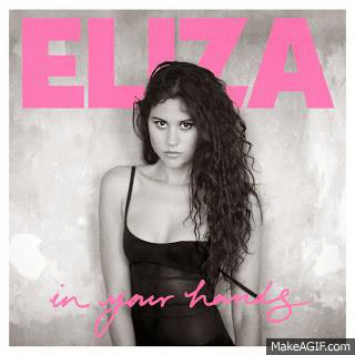
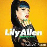
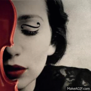
I analysed previous marketing campaigns of female artists in the indie pop genre, namely the In Your Hands campaign (Eliza Doolittle), the Hard Out Here campaign (Lily Allen) and the What We Saw From The Cheap Seats campaign (Regina Spektor). This is what I concluded:
- Campaigns tend to use the same, or similar imagery as is used in other artefacts - this is particularly true for the album art and website. However, the images serve different purposes in the artefacts; on the album art, the image is used to make a visual impact on the consumer, whilst on the website, the same image would be surrounded by social media links/ purchasing opportunities to heighten user experience.
- The logo and the font used should be consistent throughout all the texts.
- The colour scheme should be instantly recognisable and consistent throughout the campaign to create a sense of memorability for audience members
- The props and costumes that appear in the music video could also be featured on the album art/ website as iconography that becomes instantly recognisable.
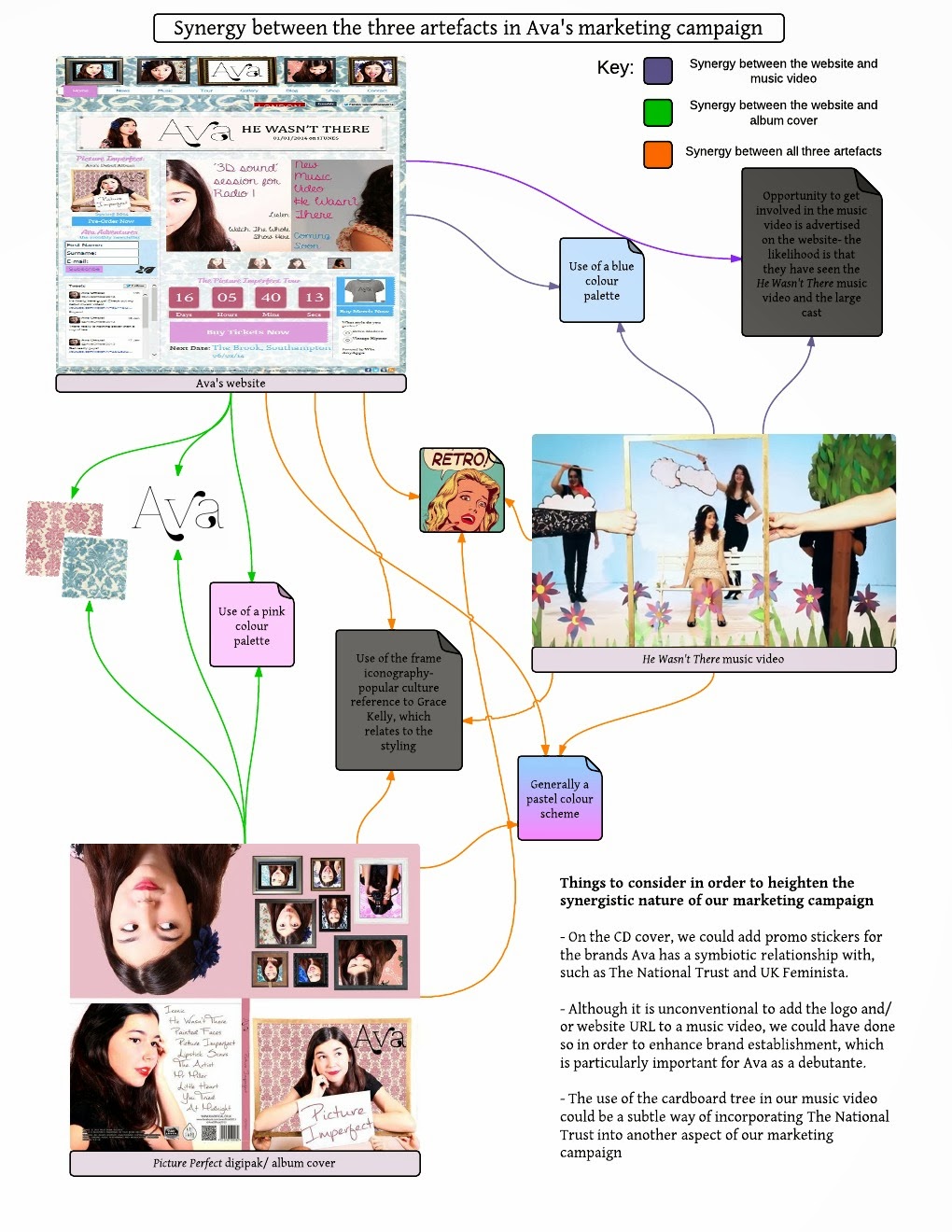
How we incorporated synergy into our campaign
Below is a flowchart/ mindmap demonstrating the ways we created an effective combination between our texts, both visually and through the information we provided.
- I found particularly that it was easier to establish synergy between the album cover and the website, because their respective design spheres share similar purposes. This is further demonstrated by the above gifs, where we see that the combination of Regina Spektor's album and website look a lot more synergistic.
- However, I also found that it is easy to use the interactivity of the website to one's advantage, and thus create a sense of synergy with the music video.
Artists in the music industry are increasingly using social media to interact with fans and provide exclusive content. Therefore, we thought it would be advantageous to incorporate social media platforms both into our website and our album cover.
- Firstly we used the same photo of Ava across all the social media platforms to create memorability and thus synergy between them
- Firstly we used the same photo of Ava across all the social media platforms to create memorability and thus synergy between them
- We also inserted links to other social media platforms on each network, but not every network had links to every other network, and in hindsight, I would've included a social media bar on all of her online marketing materials
The website is strongly associated with creating a hub and allowing an audience to interact with the artist, and in the contemporary music industry, artists use a range of social media platforms, all of which serve different purposes, in order to market themselves. We also did the same for Ava, and below is an annotated video about each of our social networks and their individual purposes within the context of the campaign.
Style and brand identity

Logo
Below is a diagram of how we researched and created Ava's main logo, which we then used on the album cover, website, social media and on merchandise.

We had previously discussed changing the colour of the logo to brown for our album cover because it worked well with our pink and gold colour scheme. However, as Ava is a new artist entering the music industry, we did not think it would be appropriate to make alterations to her logo and thus establish a better brand. It would be something to consider after the Ava brand had been established, however.
Colour scheme


We wanted to brand Ava as being quite conventionally feminine, and therefore settled on a pastel colour scheme which used pink as a primary colour. However, although the general colour scheme across the three texts is quite similar, with a mixture of pinks and blues, we can see that in the album art in particular, the pink is a lot more prominent than the blue, something which I would reconsider if I were to go redesign the album art.
Iconography
Artists usually have a piece of iconography that underpins their marketing and represents the unique selling point of their brand; usually with female artists of the indie-pop genre, this is something about their appearance. For example, Florence Welch (Florence & The Machine) has her striking red hair and Kate Nash's recently reconstructed brand image involves a heavy reliance on red lipstick.


For Ava's iconography, we decided not to use her physical traits and rather to use a symbolic prop. We decided to use a frame as our piece of iconography for a number of reasons. We analysed the significance of the frame in a semiotic sense, and below is an audio summary of what the frame represents in terms of branding and Ava's ideology as an artist:


We wanted to brand Ava as being quite conventionally feminine, and therefore settled on a pastel colour scheme which used pink as a primary colour. However, although the general colour scheme across the three texts is quite similar, with a mixture of pinks and blues, we can see that in the album art in particular, the pink is a lot more prominent than the blue, something which I would reconsider if I were to go redesign the album art.
Iconography
Artists usually have a piece of iconography that underpins their marketing and represents the unique selling point of their brand; usually with female artists of the indie-pop genre, this is something about their appearance. For example, Florence Welch (Florence & The Machine) has her striking red hair and Kate Nash's recently reconstructed brand image involves a heavy reliance on red lipstick.
For Ava's iconography, we decided not to use her physical traits and rather to use a symbolic prop. We decided to use a frame as our piece of iconography for a number of reasons. We analysed the significance of the frame in a semiotic sense, and below is an audio summary of what the frame represents in terms of branding and Ava's ideology as an artist:
The frame is first and foremost a popular culture reference to this iconic, retro photograph of Grace Kelly, the message of which we have manipulated to appeal to Ava's target audience and support her ideologies.
The frame at the beginning and at the end of the music video is symbolic of a cyclical romance


The album cover and the inside cover both present Ava in various frames, which again links to the idea that there is not one set, concrete way in which people should perceive one another.

The website header also features the same frames as those on the inside cover of the album, and this is a prime example of the way in which the use of the frame iconography works in a synergistic fashion across our media products
In conclusion, I feel that we produced a great marketing campaign for Ava through the effective combination of all of our media texts, although we could perhaps have paid more attention to colour schemes and Ava's physicality as means of establishing a brand.
Question 3: What have you learnt from your audience feedback?
We conducted audience feedback sessions not only with our core target audience, but also with our secondary and tertiary audiences, in order to be able to decipher how our video satisfies the uses and gratifications of each demographic in particular. From these various methods of feedback, we received both positive comments and constructive criticisms.
Audience Profiles


Using Blumler and Katz's Uses and Gratifications theory (1974), I analysed the way in which we planned to appeal to each of our target audiences in turn in the Prezi below.
We conducted audience feedback sessions after all the artefacts had been produced, and used a variety of methods to do so, including video interviews, audio interviews, questionnaires and online surveys, all of which gave us varied feedback about our media products, from different target audiences, including those who we did not think we had an appeal to.
Primary Audience - Female, 15 - 24 years of age
We received feedback from our core target audience through interviews, online surveys and questionnaires that we handed out at our music video's premiere/ screening.
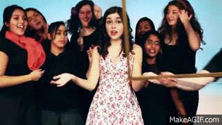
Above is a short video of girls within our primary target audience who we interviewed about our music video. We were happy to find, above all, that Ava was considered to be an aspirational and relatable artist, and thus our audience members were able to immerse themselves within the world of Ava. We received feedback from our core target audience through interviews, online surveys and questionnaires that we handed out at our music video's premiere/ screening.
We were also glad to discover that our message about feminism and the empowerment of women had been successfully conveyed to the core target audience, as many of them recognised Ava's intentional challenge to the stereotype of sexualising women in music videos. Here are some quotes from the online survey and questionnaires to support my conclusion:
"In charge of her life"
"... wasn't about to put up with any of the boy's rubbish..."
"unlike female artists in the music industry, she isn't sexualised..."
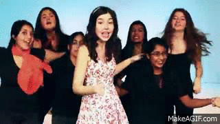
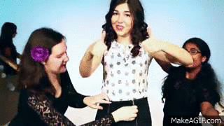
The comments were largely positive, and people in our core target audience were able to appreciate the technicalities of the one-shot, as well as how we used the props and sets to illustrate and amplify the lyrics.
To respond to some of the criticisms of our music video:
Tertiary audience - Female, 25+
 Here are some words that the tertiary audience associated with Ava and her music video. I am particularly intrigued by the word 'novelty' as it suggests that the music video and/or Ava's character are original and unconventional of the genre.
This is really positive feedback to receive from a tertiary audience member, as providing consumers with some new and unusual is the primary way in which a débutante such as Ava should aim to establish herself in the music industry.
Male audience
"I loved the style... the quick changes were really good."
Had we known that the technicalities and one-shot style of our video was appealing to a male audience prior to production, I would've drawn up an audience profile so that we could target a male audience as a secondary or tertiary market. To the right is an animated version of what I'd expect our typical male audience member to be like.
- With reference to the choreography and fluidity of the transitions, we strongly feel that although we did rehearse quite a lot prior to the shoots, we could have done with more rehearsals with the whole cast rather than only with our lead/ backing dancers.
- I completely agree with the point on lighting; we ended up having to use floor lights on the final shoot in order to decrease the intensity of the shadows that were hitting the white curtains, but we were still unable to completely eliminate them.
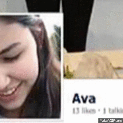
Our album art was also quite a success with our core target audience. Here are some quotes from SurveyMonkey to demonstrate this:
"... the middle panels of Ava pulling faces are funny"
"I like the fonts, the way Ava's logo stands out and the handwriting font on the back cover"
However, one person felt that our album cover was "too pink", and my interpretation of this is that Ava's message of empowering women through conventional, traditional femininity was not conveyed well enough.
Secondary audience - Female, 8 - 14 years of age
Below is the audio for a short interview I did with a member of our secondary target audience. I found that many of the things that she said corresponded to the profiles we had drawn up prior to production, but some aspects were also pointed out that we hadn't considered previously.
Below is the audio for a short interview I did with a member of our secondary target audience. I found that many of the things that she said corresponded to the profiles we had drawn up prior to production, but some aspects were also pointed out that we hadn't considered previously.
- The satire was not successfully conveyed, and therefore she thought that Ava was going back to her lying, cheating boyfriend, when in fact, what we were trying to convey was that she was tired of his futile attempts to woo her. If we were to reshoot the video, we would have to consider heightening Ava's fed-up attitude, perhaps through body language.
- However, the constructed set and playful dancing were appealing points, which would be classed under the entertainment section of Blumler and Katz's Uses and Gratifications theory.
- The polls on the website turned out to be a focal point for the younger audience; although they were initially there to provide an opportunity to interact with Ava, I now think it gives the younger consumer the power to make a choice and thus becomes an appealing feature.
- We did not include an About page/ Bio, but in hindsight I think this is an extremely important page, particularly for a debut artist who has a message/ideology to convey, as Ava does.
Tertiary audience - Female, 25+
Here are some words that the tertiary audience associated with Ava and her music video. I am particularly intrigued by the word 'novelty' as it suggests that the music video and/or Ava's character are original and unconventional of the genre.This is really positive feedback to receive from a tertiary audience member, as providing consumers with some new and unusual is the primary way in which a débutante such as Ava should aim to establish herself in the music industry.
Male audience
Initially, we did not think that our video would be appealing to a male audience because it is so explicitly feminine in its style and the themes that it deals with. However, we ended up receiving an overwhelming amount of positive feedback from male viewers through interviews, online surveys and screening questionnaires. Here are some of the positive comments we received:
"... simple idea but worked brilliantly."
"I loved the style... the quick changes were really good."
Had we known that the technicalities and one-shot style of our video was appealing to a male audience prior to production, I would've drawn up an audience profile so that we could target a male audience as a secondary or tertiary market. To the right is an animated version of what I'd expect our typical male audience member to be like.
That said, we also received some negative feedback regarding our characterisation and branding of Ava:
"She seems a little stereotypical..."
"Ava seems to be very selective..."
"... I just wasn't invested enough"
- We most likely did not fulfil the Personal Relationships aspect of Blumler and Katz's Uses and Gratifications theory for our male audience, as the video was female-fronted, and thus has decreased relatability for a male audience.
- Furthermore, we may also not have fulfilled the Personal Identity criterion because of the negative way in which we presented Matt, the boyfriend character. This is important because if a male character is portrayed in this manner, the male audience has very little to use as a basis for developing their own identities from positive sources.
In conclusion, I feel that we successfully appealed to our target audiences, but could have worked more on our appeal to the male audience, as they make up a substantial percentage of the general audience for music artists.
Question 4: How did you use new media technologies in the construction and research, planning and evaluation stages?
We made effective use of new media technologies across the research and planning, production and evaluation stages of the project, which gave us the opportunity to explore new methods of presentation, and also to enhance the three texts that we produced.
Research and Planning
I used music-sharing platforms such as YouTube, iTunes and Amazon in order to further research genres that I liked, such as indie pop, indie rock and alternative. However, the platform that I found most useful was Spotify, because the 'Related Artists' page on each artist's page made it really simple both to find a track that I liked, and to collate potential reference points for later on in the project.

We used social media platforms, primarily Facebook, to communicate during the research and planning stages. We had both a Facebook message and a group between us, because we found that it was quicker to get responses on the group message, whilst the group could be used to post photos of costumes, props and sets. Facebook was particularly effective because people in the group were generally able to access it either on a computer or on a smartphone, and sharing links and photographs was a much more efficient process.
 |
| Screenshots of the Facebook message where we discussed research and planning, production and evaluation |
 |
| Discussing pre-production on the group message, including costumes and props/ set construction |
We also used eBay in order to source cheap props to use in our music video, such as the fish hat and artificial flowers


Production
As well as using Facebook to communicate between the group, we also created a secret Facebook group for our cast and crew, where we posted essential information before each shoot, such as costumes, requests for props and timings.
 |
| Screenshots of the secret Facebook group we created for our large cast and crew, with some of the posts we wrote |
During the production of the music video, we decided to use the Canon 5D, a camera which improved the quality of the video greatly by providing a greater depth of field, which was particularly beneficial as our sets we're created so they looked three-dimensional.


In terms of lighting, we used studio lights, specifically ARRI Redhead 1000K lights, flooding these lights in order to provide a feel of high key lighting [Left: a photo of our lighting set up, as shown from the lighting booth in the studio].
However, we found that with our multiple props, there were often shadows hitting the white backdrop. Therefore, on our final shoot, we also used 650K floor lights in order to avoid these shadows, which also made our final video much lighter and brighter than the one-shots we had taken during previous shoots.


The photo on the left shows how dark the set looked without the addition of floor lights, and I therefore think that using the floor lights on our final shoot greatly enhanced the visual style of our music video, as by brightening it, I feel that we can amplify the light-hearted, playful atmosphere of the video.
We'd previously used Adobe Premiere Pro and After Effects to edit footage, and although we did not have much editing for this particular project, there were two notable pieces of editing that utilised the technologies provided by Premiere Pro.
Firstly, having discovered that there were slight flaws with the beginning of some takes and the ends of others, we decided we would utilise one of our cutting points in order to maintain the illusion of a one shot video. We therefore
edited the tablecloth from a previous take on After Effects, and then input it so that it would cover the gap between the two shots that we had used in our final video. The gif to the right demonstrates the final outcome.


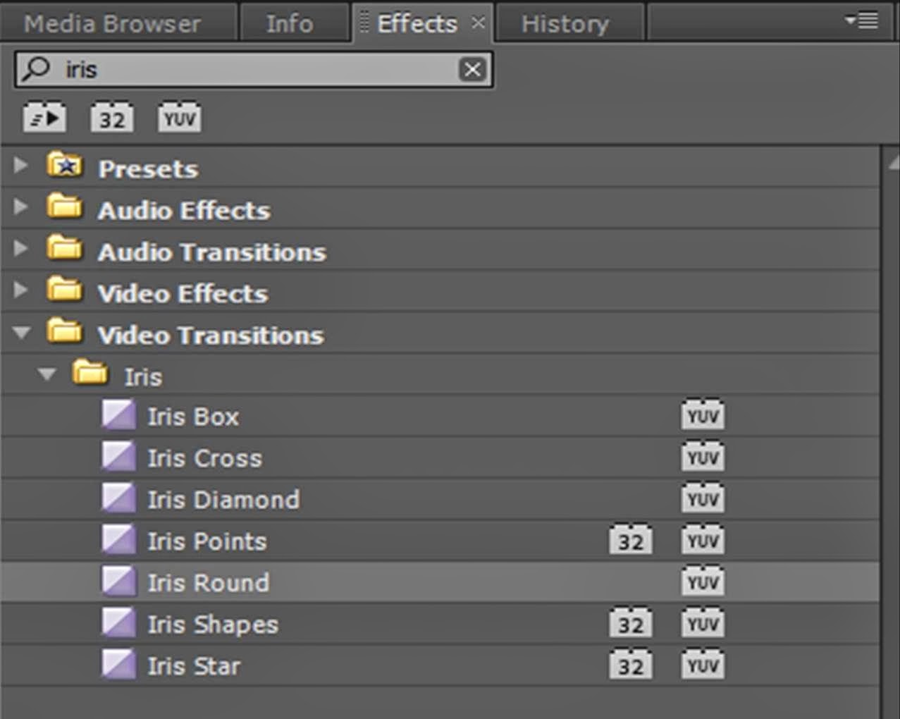 We created this effect through the video transitions available on Premiere Pro. The effect we used is called "Iris Round" and we reversed it so that the final focal point was Ava's face.
I personally really like this effect as I think that it allows us to have a large cast without detracting from the focal point, which is Ava. I also think it helps us to establish our genre and perhaps heighten the comedic notion of the video.

In terms of the album cover, we edited extensively using Photoshop CS5. We really wanted to do something intelligent with our album cover, and thus we created an illusion of Ava coming out of the frame. Below is a diagram that summarises the processes we used when editing the album cover:

On the back cover, the primary thing to consider was the placement of text, but institutional information and the track list. We researched appropriate fonts on dafont.com, and the diagram below explains the creative processes used when editing the back cover of the album.

We used an online website-building software called Wix to create our websites. I had experience using this software before, but I had only used pre-made templates, and therefore building a website for Ava from scratch proved to be quite a challenge.
One way in which we utilised new media technologies during the production of the website was the installation of various HTML widgets on the homepage in order to increase interactivity for the visitor, by giving them the option to visit other websites associated with Ava, and also by giving the consumer the power to choose. We also used Photoshop on several entities on the website, in order to create artefacts that matched with the style and colour scheme of our campaign. The prezi below summarises this:
One way in which we utilised new media technologies during the production of the website was the installation of various HTML widgets on the homepage in order to increase interactivity for the visitor, by giving them the option to visit other websites associated with Ava, and also by giving the consumer the power to choose. We also used Photoshop on several entities on the website, in order to create artefacts that matched with the style and colour scheme of our campaign. The prezi below summarises this:
 Evaluation
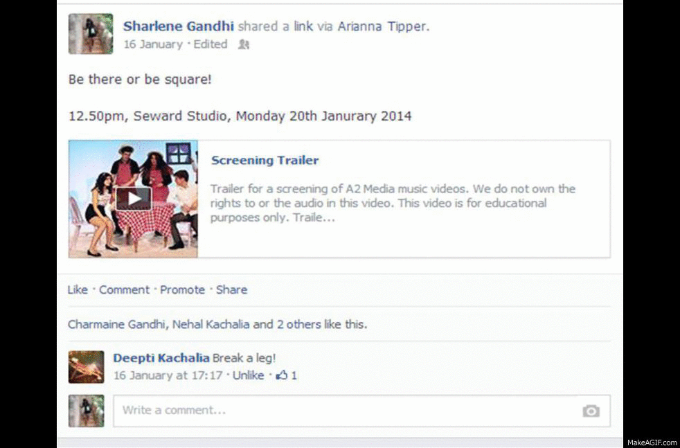
As we did in the other stages of this project, we relied heavily on social media in the evaluation too, particularly to promote a premiere/ screening we hosted in order to obtain suitable audience feedback from our core target audience. As well as this, we produced a short 12-second promo video/ teaser of our music video in order to spark interest.

The music video survey received the most feedback, both positive and constructive criticisms, because this particular survey was heavily promoted on Facebook walls, specialist Facebook groups, and through Twitter.
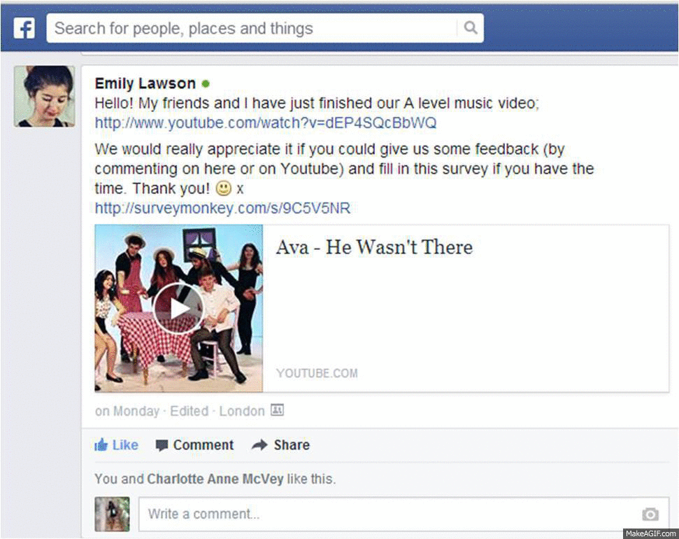
- All four of us posted both the finished video and the survey on the music video on our Facebook walls, whereby we were able to target all of our target audiences, including potential wider audiences who we had not previously thought our video had an appeal to.
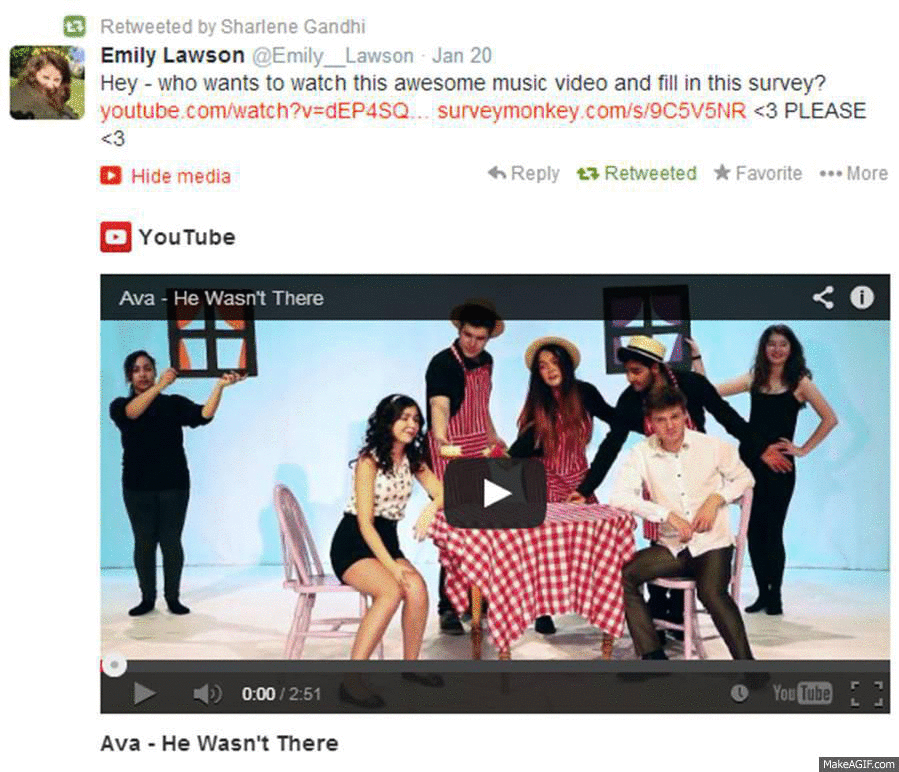
- We also tweeted links to the video and survey in order to appeal to a new demographic of people, targeting those particularly who worked in creative professions, such as fashion, magazines and publishing.
- Emily and I further specialised our audience feedback by posting in the Facebook groups for 4Talent and Company Magazine respectively. We felt that this was appropriate to do because these groups are effectively concentrated masses of our primary and secondary audience groups; 4Talent appeals to young people wanting to work in film and television, whilst Company Magazine's secret group attracts predominantly female readers between the ages of 16 and 24 interested in fashion, art, magazines and technology.
Technology used/ Purpose
|
How I found the experience of using this
technology
|
To capture on-screen activity
|
I found that using Camstudio is a particular
challenge in the way that it requires meticulous planning before filming,
which I think helps to solidify the opinions expressed in the videos.
|

To create simple mindmaps and flowcharts using
both text and visuals
|
This was an extremely helpful tool that I
utilised multiple times in order to point out details in the texts we
produced and also to explain why we added them
|

To be able to place thoughts and opinions on a
certain subject onto an online wall
|
Padlet was great for analysing the audience
feedback and thus being able to split the feedback into groups of positives
and criticisms. I could also see the ratio of positive comments to critiques.
|

To create a virtual person whose appearance,
personality and opinions can be altered
|
I used Voki to create a simulated avatar of
what I’d expect a male audience member to be like, which was useful because I
could use the audience feedback that we received from the male audience in
order to fabricate this image.
|

To enhance the visual quality of a
presentation by taking the viewer through a process of sorts
|
I used Prezi multiple times because not only
is it visually pleasing, but it also takes the viewer through a process, and
I could therefore use it to explain a theory and then demonstrate how I put
the theory to practice.
|
To fabricate simple gifs from Youtube videos
and still images
|
I’d never really made gifs before, but I found
that GifSoup was incredibly easy to use, and that I could create gifs from
our music video and our visual references with little difficulty. I also made
gifs out of still images, which I think were really useful in terms of
displaying similarities between certain artefacts.
|
To display the primary colours used in any
still image
|
Color Palette FX created a spectrum depending
on the still image I uploaded, and having uploaded a still from the video,
the album cover and the website homepage, I was able to note that our
intended colour scheme of pink and blue had not been used fully on our album
cover, which could be an issue in terms of establishing a synergistic
marketing campaign.
|
Overall, I feel that I have made good use of new media technologies throughout the project, as I not only used available resources to improve the texts we produced, but also learnt how to use new media technologies that I had not encountered previously.
Subscribe to:
Posts (Atom)